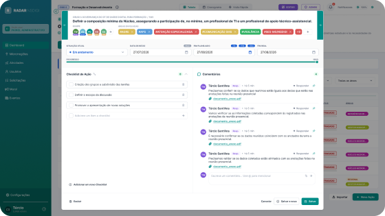
RADAR
SES-MGTracks the Department’s projects in primary care units, like a task board for public health.
My role Product design and user interviews that guided the feature redesign.
I’m Tércio, a Senior Product Designer for complex digital products and Design Systems, currently shaping public health services for Minas Gerais, with AI built into my workflow.
 576 × 430
Over 6 years of experience designing digital products. Since 2024, I’ve been working with the Minas Gerais State Health Department, leading design from discovery to implementation review, all supported by a Design System I built.
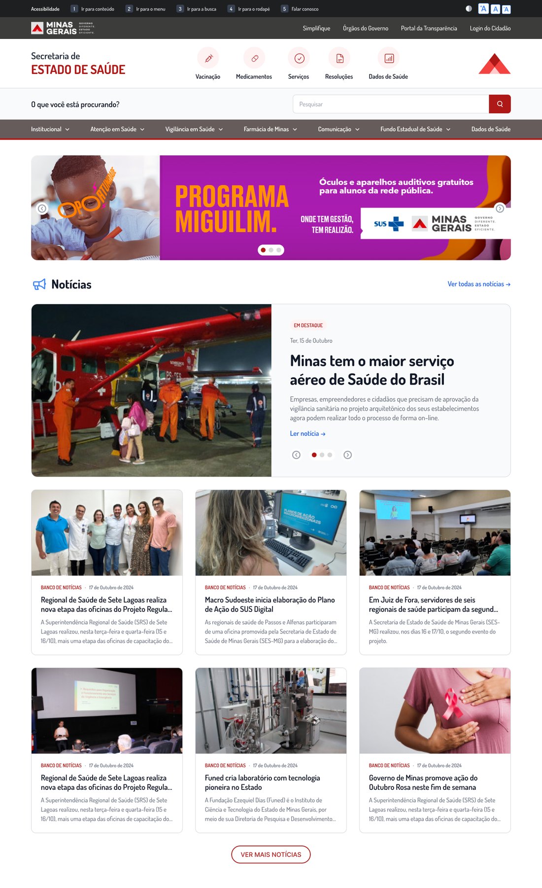
Redesign of the official health portal of a state with 21 million people: from audit to launch.
Tracks the Department’s projects in primary care units, like a task board for public health.
My role Product design and user interviews that guided the feature redesign.
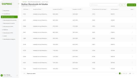
Distributes public funds to hospitals and health centers across the state.
My role Product design of the funding workflows, on the shared Design System.
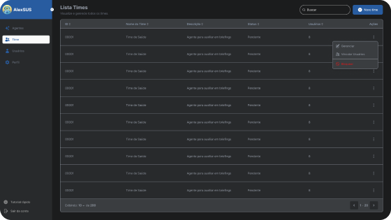
AI assistant that gathers and summarizes regional data for senior leadership.
My role Product design of the assistant’s interface on the shared Design System.
Research-driven government products, an international project for the UN, and an app I built on my own from idea to store.
A task organization app for Android, live on Google Play ↗.
Sole designer with researchers, developers and educators.
End-to-end design of an international project, web and mobile.
I created the Design System for the new phase of the Minas Gerais government and coordinate its evolution and governance. It turned products with different interfaces into one consistent family, with less rework, and I trained two designers to carry it forward.
color/brand/700
Built on an adapted Tailwind CSS base (colors, type, spacing and breakpoints), so design and code speak the same language.

button/primary
Guidelines that serve as the reference for engineering’s component library, reviewed with developers before each release.

page/style-guide
Files structured with clear pages, sections and documentation, so designers and developers find what they need on their own.

AI takes care of the repetitive parts so I can spend more time on research, decisions and people. I connect Claude, Figma MCP and the Design System with skills I wrote, and every output is reviewed and refined by me.
generate
Claude drafts first versions in Figma from existing components and tokens. From there I refine layouts, flows and details myself.
review
My own Claude skills flag accessibility and consistency issues early. I review each finding and decide what actually changes.
test
AI personas pre-check flows against Nielsen’s heuristics and WCAG to catch obvious issues before I validate with real users.
Redesign of the official health portal of Minas Gerais, from audit to launch.
The SES-MG portal is the digital front door to public health in Minas Gerais. Citizens come looking for vaccines or medicines, municipal managers for resolutions and funding transfers, and health professionals for bulletins and protocols.
The old site did not live up to that role. It also needed to get ready to grow, becoming the entry point to several Minas Gerais government subsystems.
The menu had several nested sublevels, and it was hard to know where each piece of content lived.
Every button, banner and card followed a different style.
The portal followed neither the Brazilian Government Digital Standard nor the WCAG accessibility criteria a public website should meet.
Finding a specific document or service came down to luck.
Before designing anything, I mapped every possible path through the site and inventoried each component: where it appeared, what it was for and how it varied. The categorization document recorded buttons, cards, search field, carousels, menu and footer.
Why: on a public website with years of accumulated content, redesigning without that map would mean losing pages or repeating the same problems with a new look.
I restructured the site hierarchy into two layers that live side by side:
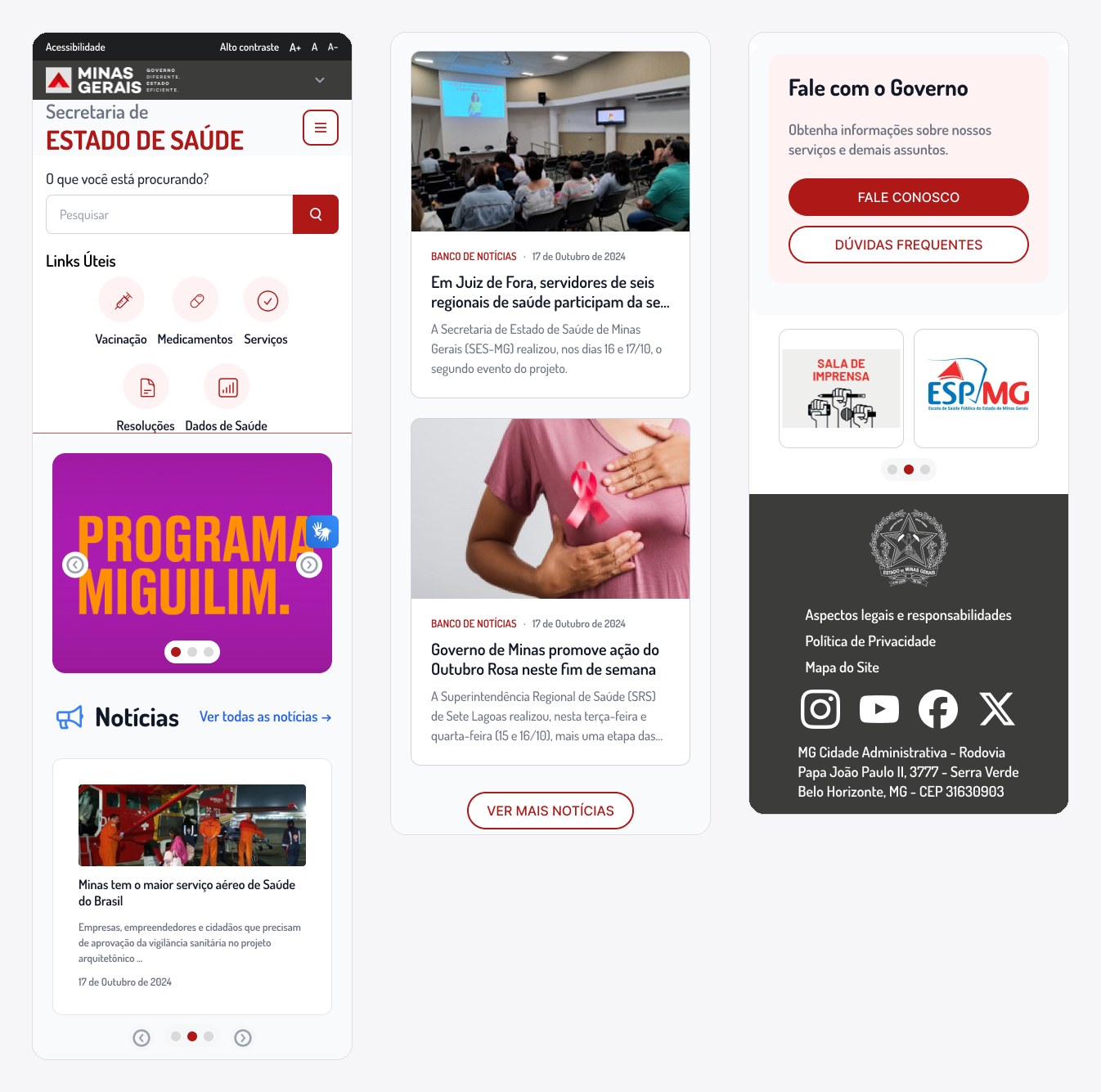
On the home page I added shortcuts to the most searched tasks: Vaccination, Medicines, Services, Resolutions and Health Data. Anyone arriving with a specific need gets there in one click, without going through the menu.
Each of the roughly 65 screens was numbered by its position in the hierarchy (e.g. 1.7.3 Councils, 2.8.2 Campaigns), giving the development team and the Department a shared reference to discuss the site.
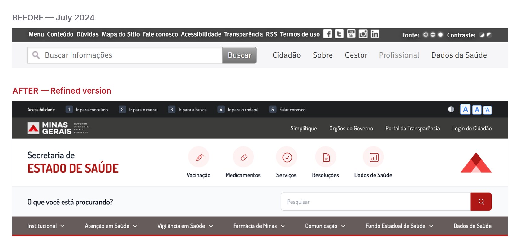
With the inventory in hand, I created the components that replaced dozens of old variations: buttons, news cards, banners, carousels, date display, search field, menu, footer and page templates. On top of them I added a style guide with around 390 icons.
That foundation became the institutional Design System. Every screen uses the same components, which keeps things consistent and lets new pages be created without starting from scratch.
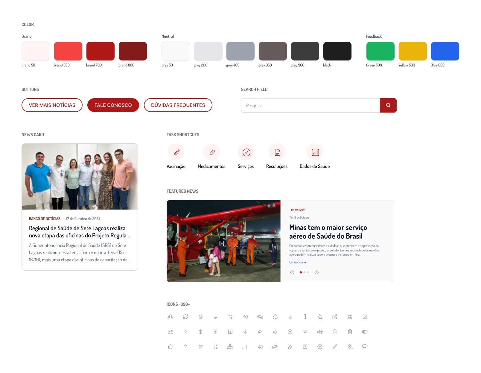
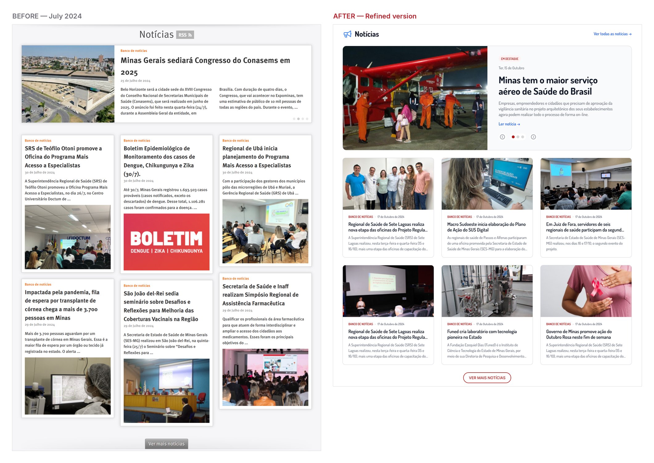
Since a large share of visits are about finding a specific document or service, search got its own attention:
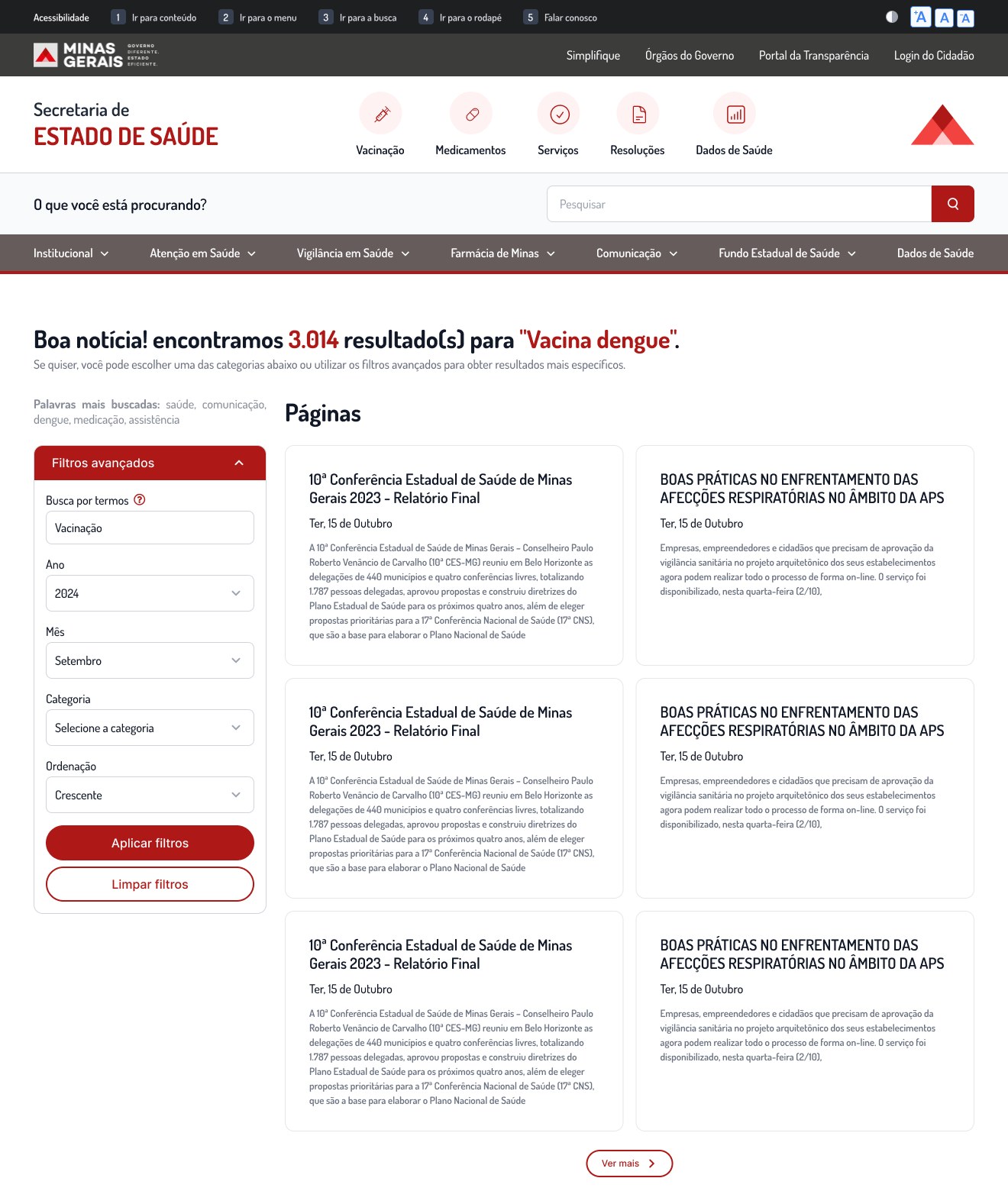
I followed the Government Digital Standard and aimed to meet WCAG as fully as possible:
As the sole designer, I worked directly with the Department’s team. Each delivery went through one or two rounds of presentation and adjustment before approval, aligned with the PM and developers to keep solutions feasible.
I then led the handoff: documented screens, explained behaviors and components, answered questions during implementation and reviewed what was being built. That closeness is what allowed a 65-screen project to reach launch.
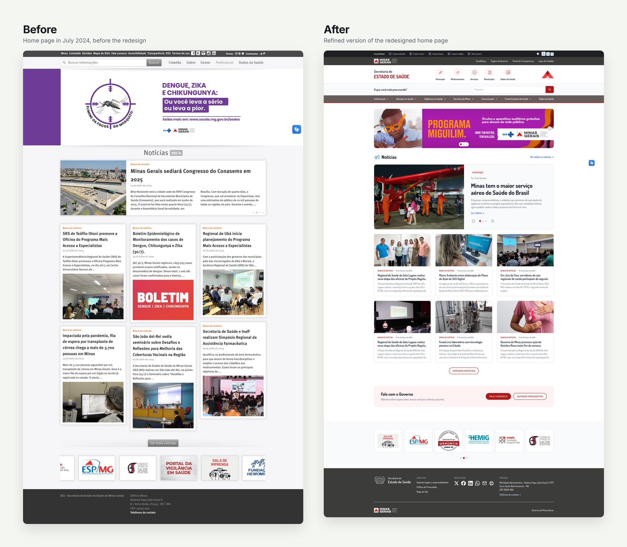
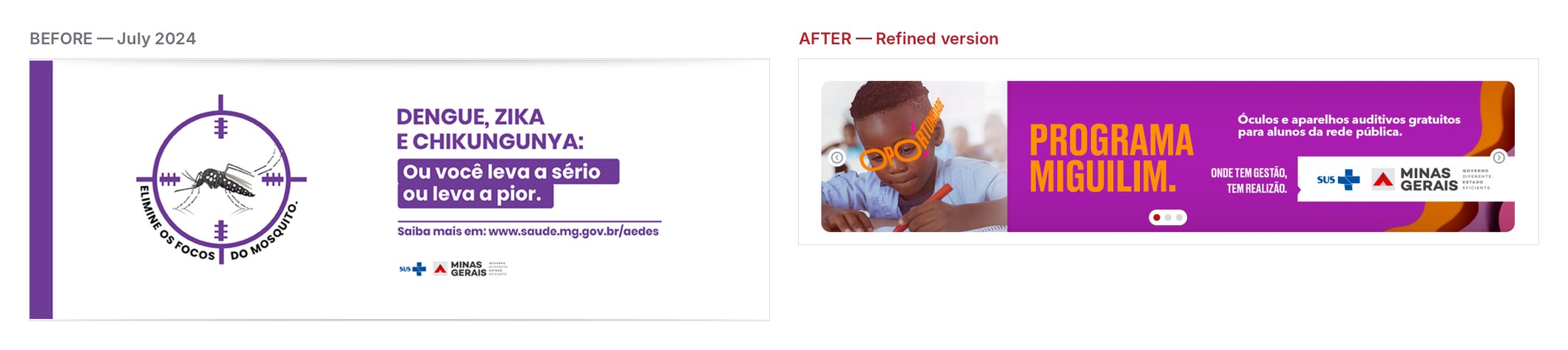
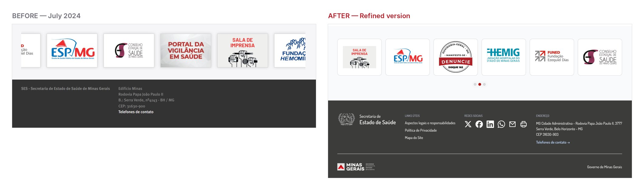
Later, I revisited the home page in the design file to refine it without changing its content or identity: type sizes, colors and spacing across the menus, a featured news carousel, cards with equal heights, rounder buttons and a footer organized into columns. The accessibility and government bars stay, as the Government Digital Standard requires.
Handoff doesn’t end when the file is delivered. Part of the implementation drifted from the prototype. Today I follow quality review together with the development team until launch.
Validate with end users. Validation was done with the Department. In a next cycle, usability tests with citizens and managers would show whether the shortcuts and the new search solve the most common tasks.